How I Created a Homepage That Felt Like an Invitation
For a long time, I thought my homepage had to explain everything.
Who I was. What I made. Why it mattered. So I kept adding words.
More sections. More justifications. And every time I looked at it, it felt heavier.
When I rebuilt my site using Systeme.io, I decided to try something different. Instead of asking what my homepage should say? I asked: How do I want people to feel when they arrive? The Moment I Stopped Trying to Impress. I remember deleting an entire section in one click.
A long paragraph explaining my background, my intentions, my credentials. Gone. Not because it wasn’t true—but because it belonged somewhere else. My homepage didn’t need to prove anything.
It needed to welcome.
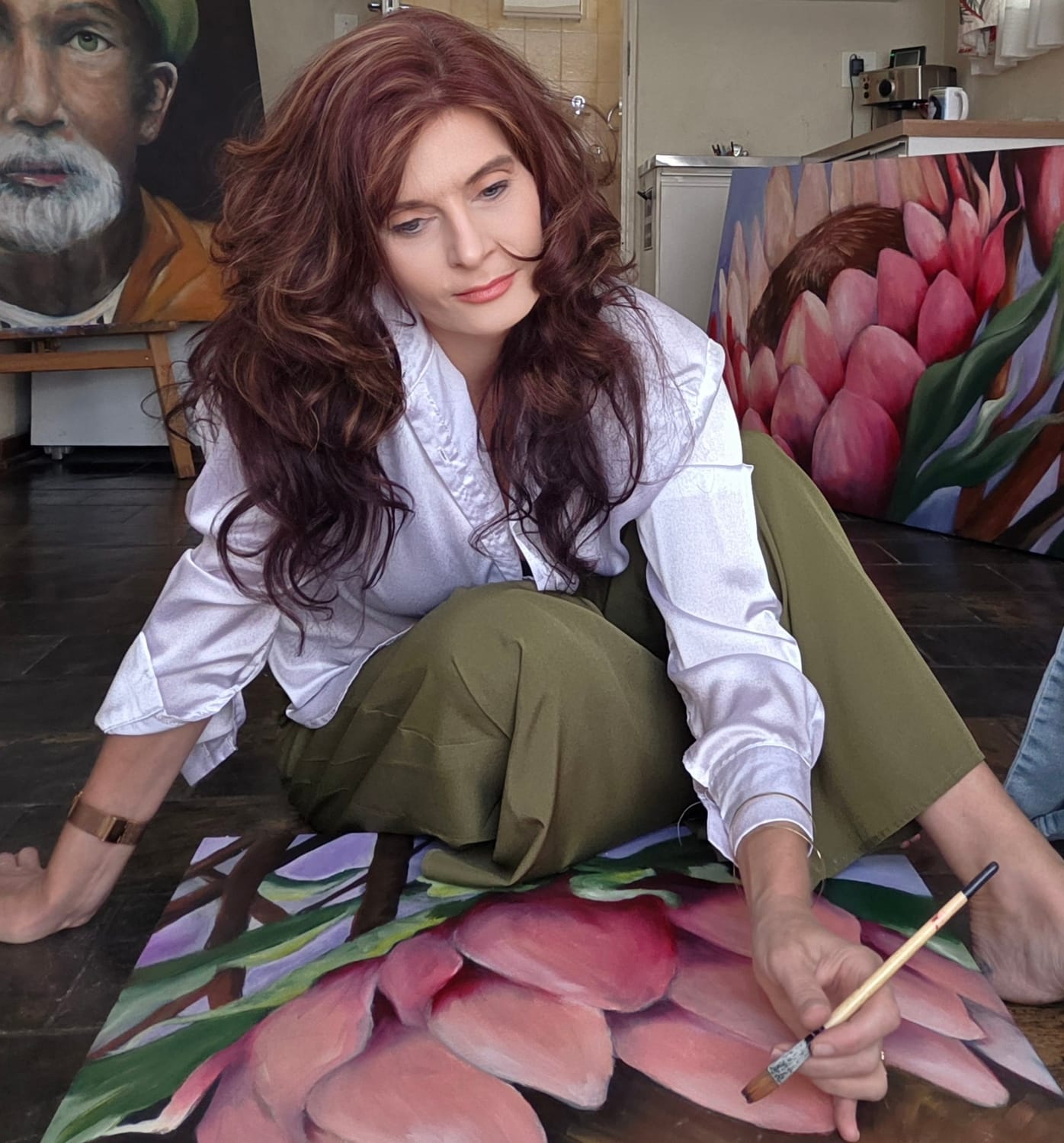
That single decision gave me clarity. Choosing One Image That Could Speak First. Instead of filling my homepage with many artworks, I chose one. One image that felt honest. One that carried the mood of my work. I let it sit at the top of the page without explanation. Systeme.io’s text blocks made it easy to adjust, rewrite, soften—until the words finally felt like mine.
I stopped asking, Is this good enough? And started asking, Is this honest?
One Clear Next Step (Nothing More) At the bottom of my homepage, I added one gentle invitation. Not five buttons. Not multiple choices.
Just one way to continue the conversation. An email signup. A quiet “stay in touch.” That was enough.
Your website is allowed to feel human. Especially at the front door.
Ready to Build Your Own Artist Funnel? You don’t need to be tech-savvy or have a big budget. You just need a vision — and I will help you bring it to life.
This is my affiliate link — I may earn a small commission if you sign up, but it’s at no extra cost to you. And trust me, this tool changed my career — I only recommend what I truly use and love.)
Hi, I’M Cornelia
Step into my studio of original oil paintings, where color, texture, and story meet. Browse the latest works, discover limited prints, and join my list for early-access releases and behind-the-canvas notes.


Subscribe here to receive my Newsletters !
We HATE spam. Your email address is 100% secure
About me
For Artists
General
For clients